
With RBS seeing an ever increasing number of customers turning to mobile devices for their banking needs, it has become imperative for the bank to ensure the services they offer are available across all channels.
As part of a small design team, I worked directly with product owners and in-house development teams to regularly release new features and improve existing ones within the mobile app.
Following an initial project briefing we'd work with the product owner to understand the core business objectives, dig in to how the service was currently being used (if it already existed on another channel), speak with customer service representatives about any problems customers were reporting, look at the analytics and discuss possible constraints on the design with technical teams. We'd also take a look at the project road map to see whether there'd be any likely impact on current projects or anything upcoming.
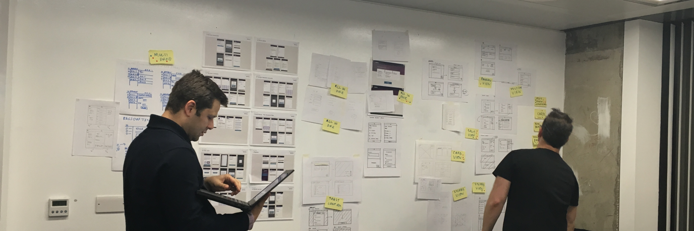
Using this research, we'd move on to drafting design solutions by starting to define processes, sketching out ideas and drawing up initial wireframes. In the vast majority of cases these would be done across all supported operating systems: iOS (iPhone and iPad), Android and Windows 10 for phone.

Knowing some customers access their online banking from multiple devices, we always looked to create solutions that functioned consistently across platforms, yet were familiar and in keeping with the operating system. And with the RBS Group having four brands (NatWest, Royal Bank of Scotland, Isle of Man Bank and Ulster Bank) that all share the same core app, but not always the same features, we'd make sure these varying degrees of difference were accounted for in our work.

As our concepts began to take shape we would then transfer them into interactive prototypes. These allowed us to evaluate them more rigorously, better demonstrate our thinking with the wider project team and conduct more realistic usability tests on them.
With the internal RBS development team working to an Agile process with monthly development cycles, we'd take our concepts in to their weekly planning meetings. This allowed them to have a regular sight of our work, continually assess and refine their build estimates and provide us with early feedback regards any technical implications.

Within the design team itself we'd have daily stand-ups to keep us all up to date on each other's work. This allowed us to ensure every new feature or update we were bringing to the app would stitch together neatly.
Each release of the mobile banking app has seen a significant increase in the number of services and features available to its users, making it more and more the channel of choice for all customers' banking needs.
This, combined with the continuing improvements in usability, has resulted in a steady progress in the overall customer experience, with the latest release for NatWest achieving its first 5 star ratings from customers on the iTunes store.
Most recently Natwest was awarded best banking app in the British Bank Awards 2017, run by Smart Money People:
"…NatWest's offering is probably the most well-rounded, customer-focussed, and popular app of this list. With swathes of functionality, a great user experience, and great customer reviews…"
Our work in partnership with the RNIB on improving the overall accessibility also saw the app become the first in the UK banking industry to receive 'RNIB Approved' accreditation. A significant step forward in ensuring a service that is truly accessible to all.
BBC News report: NatWest redesigns banking app for blind people